We briefly examined what components are in React in the “What Is React?”. This article will show how the process of creating a React component, including managing state, props, styling and more. As you work through the article, you will see how a component goes from concept to code. Let’s begin!
If you want to jump straight to the source code, check it out on GitHub here
The Playing Card
The component that we’ll be creating today is a playing card component. Firstly, we need to note down all the characteristics of the playing card we want to emulate in the UI. Namely:
- Playing cards are two-sided, face up and face down
- what suit the card is
- the value of the card
- the face side of the card can be read upside down and right side up
- playing cards are rectangular with slightly rounded edges, with the vertical edges being longer than the horizontal edges
As we are just building the UI component, the card’s value can be represented by a string value, and the game engine can convert the picture cards to their appropriate value.
Now that we know what attributes we want the playing card to have, we can start building the component.
Naming The Component
In this instance, the name of the React component is self-evident, PlayingCard. This is not always the case, and it can often become difficult to name React components in an application where you are trying to be unambiguous and unique in your naming. For example, if our application used multiple playing card decks, then PlayingCard might not be descriptive enough and might also get in the way of naming other decks cards.
Now that we know the name, we need to build a function PlayingCard that will return the visual representation of the playing card.
Writing The Function
Creating a component in React is done by creating JavaScript functions with JSX expressions mixed in. Let’s create a file for our new component:

Now that we have a file for the component, we write the function:
function PlayingCard() {
   return (
      <p>Playing Card</p>
   )
}
This is a perfectly fine function. It doesn’t do anything except return the HTML paragraph with the text Playing Card. Here is the output:

Next, we need to add the data properties to the PlayingCard. We will start with the suit and the value of the card.
Adding Props To The Component
For this component, we will pass the suit and value of the playing card from the parent of the card. We use props to pass values into a React component. Props are parameters that are passed into our component function.
Our function signature will change with the props argument being passed in.
function PlayingCard(props) {
   return (
      <p>Playing Card</p>
   )
}
Defining The Props Component
The props object, in this case, contains the suit and value of the card. So an example of the props object would look like this:
const props = {
   suit: "Hearts",
   value: "10"
}
We can now update the text of the card to show these values like this:
function PlayingCard(props) {
   return (
      <p>The {props.value} of {props.suit}</p>
   )
}

To make the code a bit neater, you can use destructuring to extract the individual keys from the props argument in the function signature. Our function would then become:
function PlayingCard({suit, value}) {
   return (
      <p>The {value} of {suit}</p>
   )
}
We restructure the props argument with {suit, value}, and the function code only needs to specify suit or value to use the props now.
Adding State to the component
Now we have the information required to draw the face of the card. We also need a way of determining whether the card is currently face-up or face-down. You can store this information in the state of a React component using hooks.
We will add the useState hook and create a local boolean variable called isFaceUp. If isFaceUp is true, then the suit and value of the card can be read. If it is false, we hide the values and show the back of the card.
import { useState } from "react";

function PlayingCard({suit, value}) {
   const [isFaceUp, setIsFaceUp] = useState(false);
   return (
      <p>The {value} of {suit}</p>
   )
}
Line 4 in the above image shows the isFaceUp variable being created as state. To change the state of isFaceUp, we can use the second const parameter setIsFaceUp. We have defined the initial value for isFaceUp to be false.
It is important to note that you could also pass isFaceUp as a prop to the PlayingCard component, but there is a use case that will be covered later for why I have used state for isFaceUp.
Using State for conditional rendering
We now update the return statement of our React component only to show the suit and value when the card is facing up by adding a conditional statement that tests the value of isFaceUp.
import { useState } from "react";

function PlayingCard({suit, value}) {
   const [isFaceUp, setIsFaceUp] = useState(false);
   return (
      isFaceUp && <p>The {value} of {suit}</p>
   )
}
Line 6 has been updated to use the logical AND short circuit operator to only render the paragraph when isFaceUp is true.
Updating State based on events
Currently, there is no way that the value of isFaceUp can change. Let’s address this by adding a method to flip the card over when touched.
We only have the paragraph text currently in the component, so we should add a box around this to represent the playing card. We’ll implement this as a div with a border for now.

import { useState } from "react";

function PlayingCard({suit, value}) {
   const [isFaceUp, setIsFaceUp] = useState(false);
   return (
      <div style={{maxWidth: "70px", minHeight: "100px", border:"2px solid red"}}>
         {isFaceUp && <p>The {value} of {suit}</p>}
      </div>
   )
}
To listen for clicks on the div, we add the onClick attribute like this:
<div onClick={() => setIsFaceUp(!isFaceUp)}
This code will toggle the isFaceUp boolean value each time anywhere on the div is clicked. You can see this in action in the following gif:

Styling The Component
At this point, it will be helpful to look at actual playing to refresh our minds about what we’re trying to build.

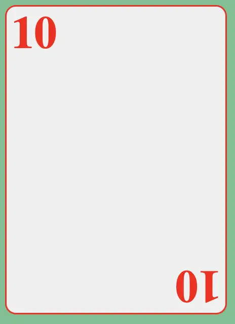
The 10 of Diamonds shown here will be a good style card to design. The most important aspects are that the card can be read either side up. The back of the card has a white border with a red background, so we can try to emulate the same on our playing card.
Sizing The Playing Card
Now that the card shows the value and suit and can be flipped to show the reverse side, we can style it to look more like an actual playing card. Let’s set the card size to match the physical card size ratio. A typical card size is 3.5” x 2.5” or a ratio of 7:5. To convert inches to pixels, we can pick a resolution of 96 PPI (Points Per Inch) and multiply each length by the PPI.
In this case we have: 96 x 3.5 = 336 and 96 x 2.5 = 240 leaving us with a card dimension of 240px x 336px
We can update our div to use these dimensions like this:
style={{width: "240px", height: "336px", border: "2px solid red"}}

Softening the corners
With the card size sorted, we need to soften the corners now. Typical rounding of playing cards is done at about the 1/8” mark. So applying the PPI vs 1/8”, we get 12px (1/8*96=12). Let’s apply the border-radius property to the div.
border: "2px solid red", borderRadious: "12px"

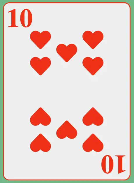
Placing The Values On The Card
Now that the card is of the correct size and shape, we can start to lay out the design of the card.
Additionally, we need to print the card’s value in two places. The top left and bottom right. The bottom right number is upside down.
Let’s put two H1 heading elements on the card representing the card’s value. We need to rotate one of the H1 elements 180 degrees:
<h1
  style={{
    fontSize: "50px",
    color: "red",
    position: "absolute",
    top: "0px",
    left: "5px",
    margin: "0px",
  }}
>
  {value}
</h1>
<h1
  style={{
    fontSize: "50px",
    color: "red",
    position: "absolute",
    right: "5px",
    bottom: "0px",
    margin: "0px",
    transform: "rotate(180deg)",
  }}
>
  {value}
</h1>
We now have the card with the values printed (the green is just the background to make the card more defined):
Once we have placed the values, we can put the heart pattern onto the card. This will be done in the same way that we have placed the values on the card. The first five will be put on by positioning alone, and the bottom five will be rotated when positioned.
The following code shows how the hearts are placed on the card:
<h1
  style={{
    fontSize: "50px",
    color: "red",
    position: "absolute",
    top: "0px",
    left: "5px",
    margin: "0px",
  }}
>
  {value}
</h1>
<FaHeart
  style={{
    fontSize: heartFontSize,
    position: "absolute",
    margin: "0px",
    top: "50px",
    left: "50px",
    color: "red",
  }}
/>
<FaHeart
  style={{
    fontSize: heartFontSize,
    position: "absolute",
    margin: "0px",
    top: "75px",
    left: "100px",
    color: "red",
  }}
/>
<FaHeart
  style={{
    fontSize: heartFontSize,
    position: "absolute",
    margin: "0px",
    top: "50px",
    left: "150px",
    color: "red",
  }}
/>
<FaHeart
  style={{
    fontSize: heartFontSize,
    position: "absolute",
    margin: "0px",
    top: "100px",
    left: "50px",
    color: "red",
  }}
/>
<FaHeart
  style={{
    fontSize: heartFontSize,
    position: "absolute",
    margin: "0px",
    top: "100px",
    left: "150px",
    color: "red",
  }}
/>
<h1
  style={{
    fontSize: "50px",
    color: "red",
    position: "absolute",
    right: "5px",
    bottom: "0px",
    margin: "0px",
    transform: "rotate(180deg)",
  }}
>
  {value}
</h1>
<FaHeart
  style={{
    fontSize: heartFontSize,
    position: "absolute",
    margin: "0px",
    bottom: "50px",
    left: "50px",
    color: "red",
    transform: "rotate(180deg)",
  }}
/>
<FaHeart
  style={{
    fontSize: heartFontSize,
    position: "absolute",
    margin: "0px",
    bottom: "100px",
    left: "50px",
    color: "red",
    transform: "rotate(180deg)",
  }}
/>
<FaHeart
  style={{
    fontSize: heartFontSize,
    position: "absolute",
    margin: "0px",
    bottom: "75px",
    left: "100px",
    color: "red",
    transform: "rotate(180deg)",
  }}
/>
<FaHeart
  style={{
    fontSize: heartFontSize,
    position: "absolute",
    margin: "0px",
    bottom: "50px",
    left: "150px",
    color: "red",
    transform: "rotate(180deg)",
  }}
/>
<FaHeart
  style={{
    fontSize: heartFontSize,
    position: "absolute",
    margin: "0px",
    bottom: "100px",
    left: "150px",
    color: "red",
    transform: "rotate(180deg)",
  }}
/>
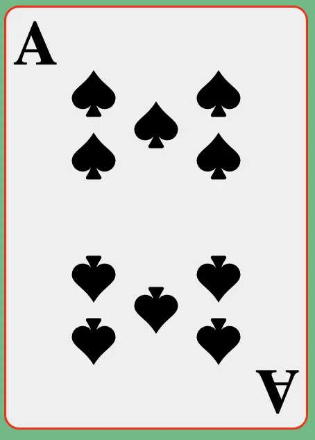
Using Props To Change The Suit Of The Card
Our React component is coming along now. We are currently taking props for the suit and the card’s value. The suit prop determines the card design. We should have red for Hearts and Diamonds and black for Spades and Clubs. The icon should also change depending on the suit.
The code previously used a hardcoded FaHeart (from the react-icons package) to display the Heart icon. We can handle the conditional logic to display the correct suit in many ways.
In this instance, we can create a new component that takes a suit prop and returns an icon of the correct size. If we were to wrap the above elements in if/else statements, our code could be exceedingly long.
Setting The Colour Of The Card
Before getting to the icon, we must determine if the suit is red or black. We’ll set the state of the card to know the colour using setState and useEffect.
Because the suit is included as a prop, if we determine the colour of the suit from the prop and then render the card in the same React component, we’ll encounter an endless loop.
The best way to think of this is if we are driving the component’s look via props, we need to ensure we only update the look if the prop changes.
Using the useEffect hook alleviates this problem by using the optional second argument. Because this second argument is a dependency list, changing the list executes the useEffect callback.
By adding suit as the dependency, our component won’t continue to rerender unless the suit prop changes.
This is what the useEffect hook looks like for our playing card:
useEffect(() => {
    suit === "Hearts" || suit === "Diamonds"
      ? setSuitColor("red")
      : setSuitColor("black");
  }, [suit]);
Creating a SuitIcon Component
Following on, we create our SuitIcon component, which will return the correct suit icon based on the suit prop.
The idea for the React component is to replace all occurrences of <FaHeart /> with <SuitIcon />. The SuitIcon component determines the required icon for the component.
An example use of the SuitIcon component will look like this:
<SuitIcon
  suit={suit}
  style={{
    fontSize: iconSize,
    position: "absolute",
    margin: "0px",
    top: "75px",
    left: "100px",
    color: suitColor,
  }}
/>
As you can see, we are passing in suit and suitColor as props to the SuitIcon.
The new component will be straightforward. It will determine the icon to use from react-icons and return the appropriate one based on the suit prop.
Here is the code for SuitIcon:
function SuitIcon({ suit, style }) {
  if (suit === "Hearts") {
    return <BsFillSuitHeartFill style={style} />;
  } else if (suit === "Diamonds") {
    return <BsFillSuitDiamondFill style={style} />;
  } else if (suit === "Spades") {
    return <BsFillSuitSpadeFill style={style} />;
  } else if (suit === "Clubs") {
    return <BsFillSuitClubFill style={style} />;
  } else {
    // If no suit is given then we can just put out little joker faces
    return <GiCardJoker style={style} />;
  }
}
I’ve added logic to handle cases where the suit prop doesn’t match one of the expected playing card suits. Feel free to handle this however you see fit in your applications.
I’ve decided to use the bootstrap icons for the playing cards, so I’ve imported all the BsFillSuit varieties for the four suits. The GiCardJoker is a joker face for the unmatched suit clause.
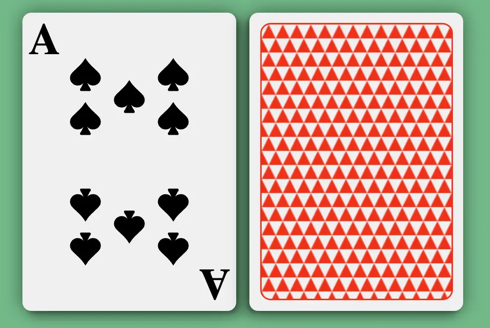
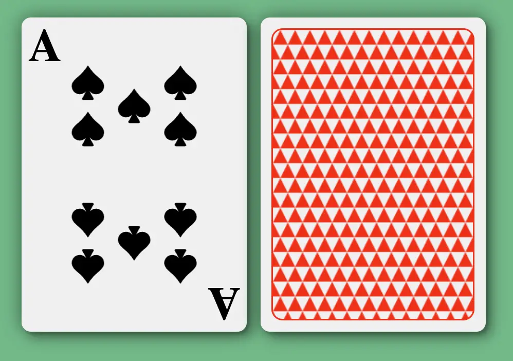
We can now control the value and style of the card from a parent component. Let’s do this with the following code that will create an Ace of Spades:
<PlayingCard suit="Spades" value="A" />
Styling The Back Of The Card
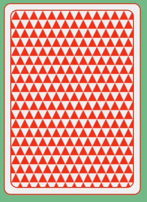
Here is the back of the card:
We need to add an inside border that contains a pattern.
Let’s create a div inside the card with a margin of 10 pixels. We’ll also consider the 4 pixels of the border from the outside border to centre the interior div.
import CardBack from '../images/card-back.png';

...

{!isFaceUp && (
  <>
    <div
      style={{
        width: "216px",
        height: "312px",
        margin: "10px",
        border: "2px solid red",
        borderRadius: "12px",
        backgroundImage: "url(" + CardBack + ")",
      }}
    ></div>

  </>
)}
The code above shows how we can use the state to show the back of the card. I’ve imported an image that I’ll use as the pattern and have then used that image as the background image of our internal div.
The result looks like this:
Now the card is starting to come together (in terms of style) nicely. We will address the outside red border and flatness of the card next.
Styling The Card Thickness
Firstly, let’s remove the red outside border and replace it with a transparent one. Secondly, we can give the card a drop shadow to make the card seem like it has some thickness.
style={{
  width: "240px",
  height: "336px",
  border: "2px solid transparent",
  position: "relative",
  backgroundColor: "#F2F2F2",
  borderRadius: "10px",
  boxShadow:
    "3px 3px 3px rgba(0,0,0,0.2), 8px 8px 10px rgba(0,0,0,0.2), 0px 0px 20px rgba(0,0,0,0.5)",
}}
For the box shadow effect, I’ve used three different box shadows to give the effect of multiple light sources hitting the card. Keeping the border transparent will keep everything in line without adjusting margins with the red border removed.
Animating the card flip
Now we get to the fun part – animating the card flip. We’ll use a basic technique to achieve this using mainly CSS. Previously we used the state to determine what side of the card was showing. Using this CSS method to flip the cards means we don’t have to use state but can use transform to rotate the card in and out of view.
Let’s look at the code changes. First, we remove the short circuit test for isFaceUp before the divs for the front and back of the card:
{isFaceUp && <>
Secondly, we remove the state definition for isFaceUp:
const [isFaceUp, setIsFaceUp] = useState(false);
Adding transforms and transitions
This is where we define how the card should flip. Specifically, we need to configure the timing of the flip and the way the card rotates. This is done by utilising three divs. One is the card, and the other two are the faces of the card.
The following code defines the additional styles we are setting on the card div:
transformStyle: "preserve-3d",
transition: "transform 0.5s ease",
transform: "rotateY(180deg)",
The transformStyle property tells the browser to keep the children elements of the card div in the 3d space (as opposed to flat).
The transition property tells the browser what transition property to execute against, in this case, the transform transition. It also defines the duration of the transition and a timing function. So we use the timing function ease to slow down the transition at the end of the transition.
For the font face of the card, we add the backfaceVisibility property with a value of hidden. This property hides the div contents when rotated.
<div style={{ backfaceVisibility: "hidden" }}>
Additionally, the card’s back face has one additional CSS property, transform. By using transform on the back of the card, we make one side of the card invisible when the component loads.
backfaceVisibility: "hidden",
transform: "rotateY(180deg)",
Adding transform with the onClick event
Previously, we used the onClick event to toggle the isFaceUp boolean state variable. We now want to transform the card when the user clicks the card. We create a new function flipCard, to set the transform CSS property to the card.
onClick={flipCard}
Here is the flipCard function:
function flipCard() {
    if (myRef.current.style.transform) {
      myRef.current.style.transform = "";
    } else {
      myRef.current.style.transform = "rotateY(180deg)";
    }
 }
You will notice references to myRef in the above function. This refers to a DOM element in a React component, so you can safely manipulate it. You can learn about refs in the React documentation here
Using the useRef hook
To create the myRef variable, we need to use the useRef hook. We set up the hook in two main steps. Firstly, create the variable like this:
const myRef = useRef(null);The
Secondly, add the ref attribute to the div we want to reference with myRef.
<div
   ref={myRef}
We can use standard DOM manipulation techniques to modify the div in ways that React doesn’t allow. In our case, we update the transform style on click.
The Final Product
Before unveiling the working product GIF, let’s review what we’ve done:
- Defined the requirements of the card
- Created a functional component
- Styled the component
- Animated the component
What we haven’t done:
- used a styling library to clean up the code
- created unit tests for the card
- handled edge cases for error handling
- handled the responsiveness of the card
Here is the final product:
The final product source code is here. Thanks for reading!