To keep your navbar at the top of a viewport while scrolling, you will need to add some specific CSS rules to your site. But first, let’s discuss exactly what we are talking about when we say navbar.
The navbar is an area on a page (navbars aren’t unique to web development, but this is the context we’re working in here) that contains elements to help users navigate your site. The bar part of the navbar comes from how websites often use a vertical or horizontal menu containing links to other pages in a site. This one-direction menu is known as the bar.
Navbars are just a collection of links and buttons making it simple for users to understand how to get around your site. This article looks at ways of keeping a horizontal navbar at the top of your view, even when you scroll down the page.
Here is an example of a navbar from the New York Times website.

Each item in the navbar links to another page on the nytimes.com website.
If you scroll down the page, you will notice that it sticks to the top of the screen as you pass through the navbar.
Whilst this is a good quality navbar, I will show simpler methods for simpler navbars first before showing how the New York Times does their navbar.
Fixing the navbar to a position and keeping it there
Keeping a navbar in the same position as you scroll is probably the easiest place to start. This can be achieved using the fixed position value along with the width and position coordinates.
.navbar {
  position: fixed;
  width: 100%;
  top: 0;
  left: 0;
}
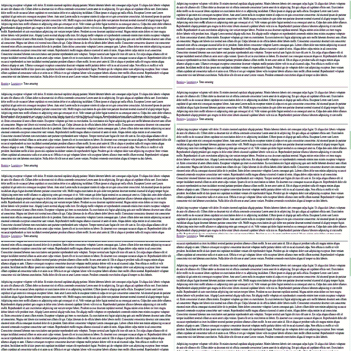
The code above will do just that. To ensure that the content following your navbar isn’t overwritten, you will need to consider the navbar’s height and position the rest of the content starting there. The image below shows an example of just setting the navbar’s position and leaving the remaining text as it was.

To overcome this issue, set the top margin of the next element to push the text after the navbar.
.content {
  margin-top: 75px;
}
This is the simplest way to keep the navbar at the top of the screen. There are, however, many other ways that you could achieve this.
Use sticky elements to keep the navbar at the top.
Sticky elements are a neat way of keeping a navbar locked to the top of the viewport. Just by using the value sticky for your position element (and using -webkit-sticky for safari users), you can achieve the effect we achieved in the first example. In the sample code below, I’ve also added a white background to make the text disappear when scrolling through the header.
.navbar {
  background-color: white;
  position: sticky;
  position: -webkit-sticky;
  top: 0;
}
Scrolling through a header and keeping it at the top
As a bonus feature of the previous example, if you were to position your navbar after some other content, you could keep the same CSS values as above, and when the user scrolls through the navbar, it will stick to the top of the page.

Conclusion
There are two very easy methods to get your navbar to stick to the top of the view. The first method cements the navbar’s position and makes the developer specify other content not to overlap. The second method allows the content to live relative to the rest of the page’s content, except that it will stick when needed.
There are many other ways to achieve the above, including using JavaScript to determine the scroll position or some other API functions, such as the Intersection Observer. Still, I think these other methods should only be used if you know what you’re doing and have exhausted the common ways of locking the navbar.


