
Debugging React apps through an IDE like VS Code or WebStorm handles one aspect of inspecting your React app. The other main aspect is seeing what is happening in your browser as your app runs. Fortunately, we can see what is happening in the browser using the React Dev Tools extension.
The React Dev Tools extension
This extension allows developers to examine the React tree of components and to profile aspects of the application. For example, you can set up the tool to see when components render as the state of the application changes. This information cannot be easily seen from within an IDE by looking at the code.
Installing the React Dev Tools Extension In Firefox
To get started, go to the Mozilla add-ons site. You should see something similar to this page:

Click the Add to Firefox button to install the extension.
You will be prompted to allow the extension to access data for all websites, input data to the clipboard and more. You’ll need to click the Add button to continue the installation. The prompt should look something like this:

Lastly, you will see a prompt asking you to allow the extension to run during an InPrivate window session. It is a good idea to allow this so you can debug your React app without worrying about the site being affected by caching. The prompt should be similar to this:

Check the check box and click Okay to continue.
The React Dev Tools Icon
Now that you’ve installed the extension, you should see a greyed-out React icon in the top right-hand corner of your browser. It should look like this (highlighted in orange):
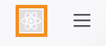
The icon is greyed out like above because the site you are currently on is not a React site. We need to browse a React site to test if the extension is working.
A good example of a React website (when writing this article) is the task management application, Asana. If you go to this website, you will see the extension become coloured, looking like this:

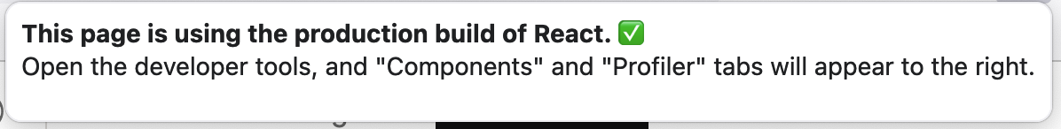
If you left-click this icon, you will see a message appear saying that the page is using a production build of React. This means the site is optimised by removing debugging information, optimising assets and minifying the code. The message should look something similar to the image below:
A quick way to tell if you are viewing a site that is the production build is to note the colour of the extension icon itself. The black background is the indicator that the site is a production build. A red background indicates a development build.
Here is an example of the icon on a development site:

Inspecting A Development Build Of A React Site.
Now that we’re browsing a development version of a React site, we can click the icon and get more information. The prompt should be similar to this:
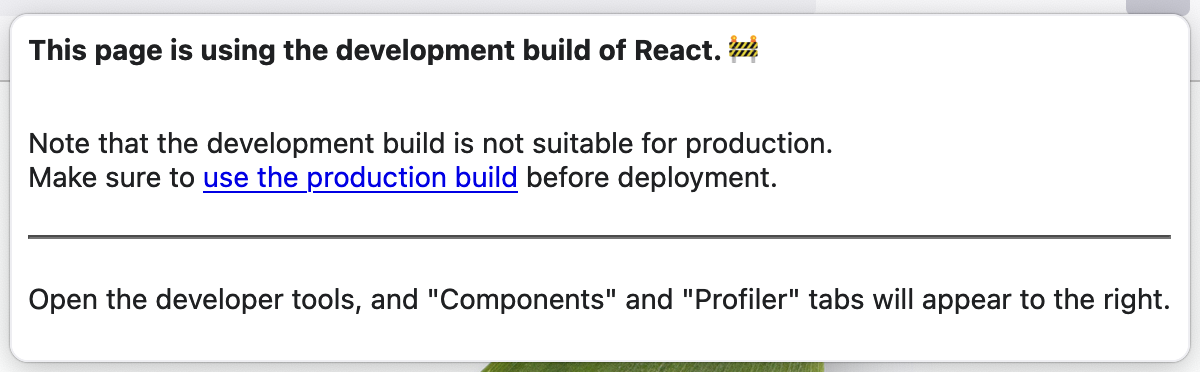
The information mentions that the current build is suitable for debugging but releasing to production (which is what we want to see). It also mentions that when opening the developer tools, we should see two new tabs: Components and Profiler.
The Components Tab
Opening the developer tools and clicking the Components button opens the components tab. This tab shows the list of React components in your current view.
To view a particular component’s details in the components tab, you can use the select tool to select the component from the view.
This is the select icon described above:

If you hover over the icon, you get some more information:
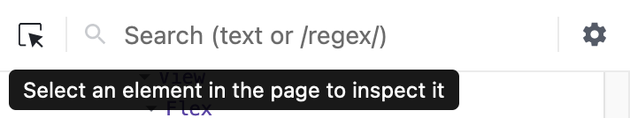
Following the prompt’s advice, we can click the select icon and select an element on the page to inspect it.
In the image below, I have selected a button in my application:
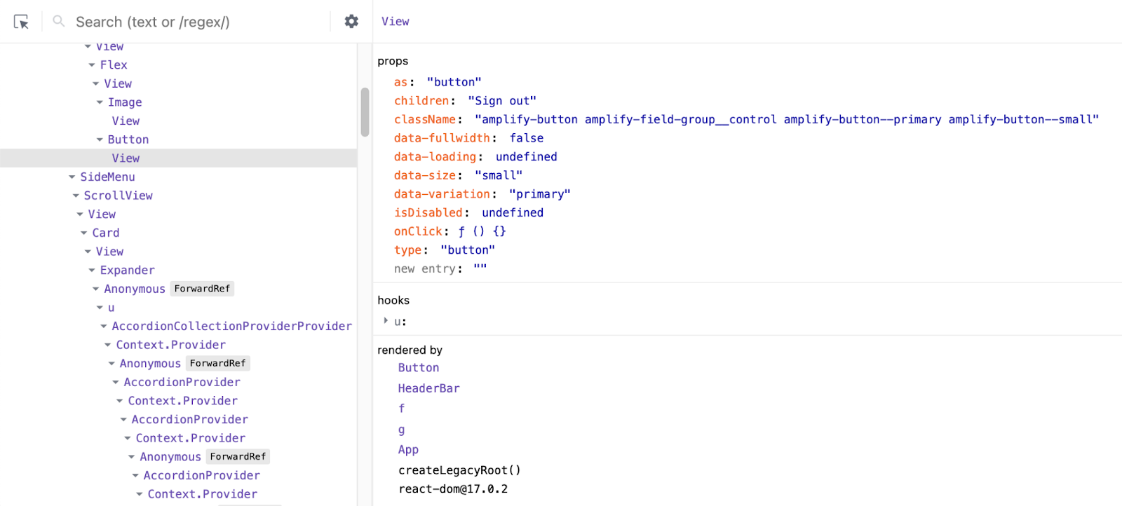
Breaking down the components tab into sections
The view can be broken down into four distinct areas. The orange area is the tree view of all the components in the current view. The green area represents the properties (props) of the currently selected element. The purple area designates the hooks of the selected element, and the blue area shows the parent tree of how the selected element was rendered.
You can think of the component view as a key/value (master/detail) pair with the key being the component selected on the left-hand side and the value being the information about the key on the right-hand side.
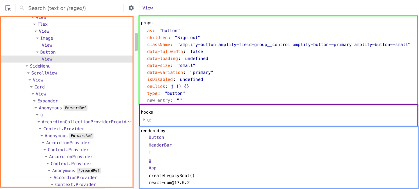
This view may change depending on the selected element. The above description is an overview of what you might be looking at.
On the right-hand side of the components tab, you will see the following icons:

The stopwatch icon
The stopwatch icon is used to suspend components. To do this, the component that you’ve selected will need to be within a Suspense container, or you will get the following message:

You can learn more about suspense in my other how-to articles:
- » Code splitting with lazy and Suspense in React
- » Suspense without lazy in React
- » Lazy loading and Suspense in React
- » Rendering a list of lazy components in React
The eye icon
The eye icon, when clicked, will take you to the corresponding DOM element. For example, I wrap an Image component with properties such as alt text, name, src etc. When I click this component in the component tree and then click on the eye icon, I am taken out of the React Dev Tools to the inspector tab, where the element selected is the img element.
The bug icon
The bug icon will log the current component to the console. For example, I clicked the bug icon while having my aforementioned Image component selected. This was the output to the console:

The <> icon
The <> icon will take you to the source code for your component. When selecting a component from the component tree, clicking this icon will take you to the debugger tab, open the source file and highlight the first line of your component. For example, my application has Beds as a component. Clicking the icon shows me this:

Component Search Box
You can also use the search box above the component tree to find your components. In the example below, I’m searching for beds, and you can see the number of beds components in the tree and navigate between these matches using the up/down arrow:

Component Details
The detail side of the component tab will sometimes show checkboxes and other icons, like in this image:

Starting with the hooks, you will notice two icons on the right.
The magic wand hook
The first icon (that looks like a magic wand) is a special tool that will update the names of the hooks to match what you’ve named them in your source code.
Doing this makes it much easier (especially in larger components) to see what is going on in your application. Here is the above image after clicking the wand.

You can now see which hook relates to what variable. This makes debugging a whole lot easier. Just note that by doing this, you will face a performance hit from the dev tools. You can see this by hovering over the wand and viewing the tooltip:

If the performance hit is too great, I might break my component down further or selectively parse hook names when I need to debug that section specifically.
The square with dots icon
The next icon is the square icon with the dots to the left and bottom of the square. You will copy the hooks information in JSON format when clicking this icon. This will allow you to view the hooks information in another app (or programmatically process it somewhere else).
Here is an example (in VS Code) of the information copied when clicking the icon with the Beds component selected:

You will also see this icon in the React dev tools tabs. It will always be the copy to the clipboard button and will copy the related information (nearest to the button) to the clipboard.
The checkbox icon on the right-hand side will appear when dealing with boolean values in hooks or props. You can manually toggle between true and false for the hook or prop.
Doing this lets, you see (in real-time) how your application will look with either value. This can be extremely handy when determining why a specific component isn’t displayed in your app.
The Profiler Tab
When you first click on the Profiler tab in the React Dev Tools extension, you will see something similar to the below image:

You can get started by clicking on the blue record button to start recording. Once the profiler is recording, you can use your application as you normally would. When you’ve finished recording the parts of your application you want to profile, come back to the Profiler tab and click the record button again, which will now be a red circle to indicate that the profiler is recording.

The Flamegraph Chart
When you’ve stopped recording, you will get a flamegraph like the one below:

Looking at the top of the chart, you’ll see two numbers. These numbers relate to the commits that occurred when you were using the application. A commit is when React applies changes to the DOM (at least at a high level).

In this example, there are ten commits, and we are viewing the first commit.
The blue bar in the chart represents the currently selected commit. If we select the fifth commit, the chart will look like this:

You can move between commits by clicking the back and forward arrows or clicking on the chart bar. The height of the bars represents how long the render took to commit.
Commit Information
On the right-hand side, you will see the commit information. It will tell you when the commit occurred and how long it took to render it. It will also tell you the scheduler’s priority of the commit. Priority can be one of several different types:
- Immediate
- Normal
- Low
- User Blocking
- Idle
I won’t dive into these priorities in this article. It’s enough to know they exist now and that React has a scheduler to determine when to render or re-render a component.

Flamegraph explained
In the flamegraph (image below), you can see what components are rendered on each commit and how long each component took to render. The length of the bar represents how long the component took to render. The coloured components are the components rendered during that commit. The grey components did not render during the commit.
Taking our beds component example from earlier, we can see that only the Beds component and its children were rendered during this commit. Unsurprisingly, each of the children components of Beds rendered in less time than Beds did.

Hovering over the Beds component will show you some more information:

This tells me that the entire duration of the commit was 11ms and that Beds took only 1ms to render.
By clicking on a component, the view will zoom to fit that component to the screen’s width. Here is the flamegraph after I’ve clicked the Beds component:

Zooming in the flamegraph
You can see that the width of the Beds component is now the width of the flamegraph. You should also note the area I highlighted on the right-hand side. This shows all the times the Beds component was rendered during the recorded commits.
Having this list of times when a component is rendered can highlight issues in your application if a component is being re-rendered too often or more often than you would expect.
To zoom back out to the original view, you can click in the white space under the flamegraph.

Saving flamegraph data
If you want to examine your profiling data later or use another tool, you can save the profile to disk as a JSON file by clicking the down arrow (next to the Flamegraph tab). If you want to reload the data later, click the up arrow and import the JSON file into Firefox.
Clicking the circle with a line through it will clear the current profile data ready for you to re-record or import some new data.
The Ranked Chart
React Dev Tools has a Ranked Chart that serves one specific purpose – to show an ordered list of components sorted by time taken to render. The component at the top of the chart will be the component that took the longest to render.
This chart is useful if you believe that a single component is a bottleneck in the performance of your application.
Here is a Ranked chart for the first commit of the app with the Beds component.

Considering the short time the entire commit took to render, it might be difficult to see, but the View and Beds components took the entire time to render. Several other components took little time (compared to Beds) to render. These components are the thin green bars you see underneath the yellow ones.
Hovering over one of these green components, you can see more information:

The React Dev Tools Settings
You can get to the settings screen if you click on the gear icon next to the commit bars:

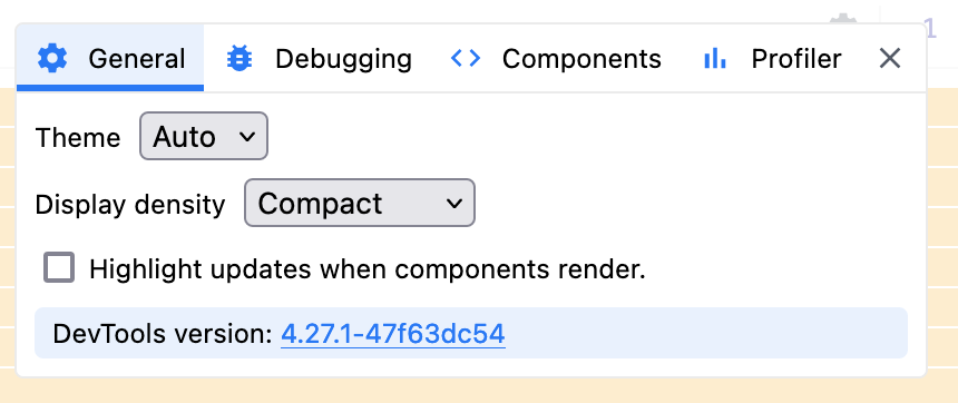
There are four tabs in the settings screen, General, Debugging, Components and Profiler.

General Settings
The General tab has three options:
- To set a light or dark theme (or follow the system settings)
- To display the charts in a compact and comfortable fashion (the height of the component bars change along with some extra spacing when using comfortable mode)
- Highlighting components when they render
If you select Dark as the theme, the settings screen will look like this:

And the Flamegraph will look like this:

The previous examples used the compact display. If you change this setting to comfortable mode, the Flamegraph will look like this:

If you check the checkbox to highlight components when they render, you will see blue boxes outlining your components when they render. This can be very useful if a component is rendering at a strange time.
For example, if your menu re-renders every time a character is typed or a button clicks, then this could mean you unintentionally have some kind of state tied to the menu.
Here is an example of the highlight that occurs once I click the add bed button in my app:

Debugging Settings
The Debugging tab has four settings:

Component Stacks
Appending component stacks to console warnings and errors. This refers to what is shown in the console when you use console.warn() and console.error() to display console messages. An example of console.warn() with the component stacks appended is below:

And an example of using console.warn() without the appended component stacks:

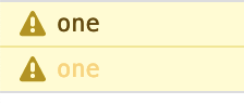
Show inline warnings and errors
This refers to the symbols placed beside component names in the stack. The example below shows a warning for the Beds component:

You can see that the Beds component shows the yellow warning symbol. The search bar also has an icon followed by the number 2. This tells us that there are two warnings on the page now. You can cycle between the errors using the up and down arrows.
Break on warnings
You can use the break-on warnings checkbox to pause the execution of the application at the point a warning is raised. Using the above site with the Beds component and the checkbox ticked, we are taken to the Debugger tab and the application is paused on this line:

There are clear instructions from the React developers about what to do next. To step out of the function, you can use the up-and-right arrow button in the debugger tools:
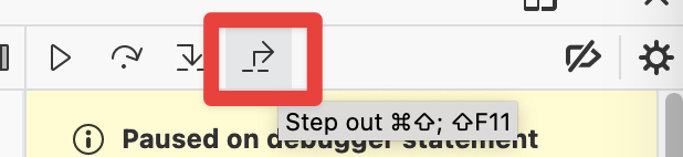
Following the instruction to step out of this function we can see this:

Looking at the source code, we can easily see where the warning has come from (console.warn(‘Message two’)).
Hide logs during second render in Strict Mode
In React 18, a decision was made so that logs would not be silenced on double renders. This was confusing for some developers trying to debug their applications in React 17.
For example, if a developer placed a log message in a component to test when it gets rendered, it would disappear from subsequent renders (sometimes), making it more difficult to debug.
This checkbox allows developers to go back to the React 17 style of suppressing log messages, which is disabled by default. React 18 will show the subsequent log messages in muted colours.
For example, this image shows React 18 with the checkbox unchecked:
Notice how the second log message is slightly duller than the original one.
When the checkbox is checked, the second log message is not displayed and we only see the original message:

Components Settings
The settings’ Components tab relates to the Dev Tools’ Components tab.

Expand component tree by default
The first checkbox determines if the component tree view starts with all nodes expanded or compressed. The following image shows all nodes expanded:

The next image shows when the checkbox is not checked. Therefore not all nodes are expanded:

Notice how the bottom Card element is not expanded. Only the elements leading to the currently selected element were expanded. If you haven’t selected a component, then only the root node will be showing. Like this:

Always parse hook names from source
The second checkbox: Always parse hook names from source – is another way to show the names of your hooks from your source code in the development tools. By checking this checkbox you won’t have to click the wand icon to show the names, they will all show by default.
Here is a hooks section without the checkbox checked:

And here is the same hook section after checking this check box

I’ve highlighted in red the hook names (on the left-hand side) and the fact that there is no wand icon (on the right-hand side). Do note of the warning that by checking this checkbox, the tools will be slower to run as there is more work to extract these names.
Open In Editor URL
This section allows developers to click an icon and be taken to the source code of that component. For example, I will enter the default vs code setting (as shown as the placeholder text): vscode://file/{path}:{line}
Now, when viewing components, you can see a new icon here:

When I click on this icon I will be taken to VS Code (you may be prompted for a security warning by your browser) and the file containing the component will be opened.
For example, if I wanted to view my landing page component, I would first select the component like this:

Then, once I’ve selected the component, I would click the Open in editor button from above.
The editor is opened and I am taken to the component in question:

Hide components where…
The hide components section is a way for developers to reduce the number of components in the tree by use of a filter. By default, the standard HTML nodes are filtered, you can see this in the following image:

All dom nodes are hidden as this rule is switched on (the blue slider to the left of the panel indicates that the rule is in effect.
If we turn off this rule you can see all the dom nodes shown in the React Dev Tools component tree like this:

You can see the dom nodes, div and img in the screenshot above. They are easy to spot as React components start with capital letters.
The add filter button just allows more filter rules to be applied to the component tree.
Profiler Settings
The Profiler tab in settings relates to the Profiler tab in the dev tools. There are only two options in these settings:

Record why each component rendered while profiling.
The first checkbox allows the developer to see why a component has been rendered inside the profiler. If we check this box you can see profile information like below:

In this example, I have clicked on a Card component and the profiler now tells me that this rendered because the props changed.

If you click around the different components on different commits, you can see multiple reasons components were rendered. For example, if a component is rendered because its parent rendered, then you would see the following:

Hide components below
The second checkbox allows developers to filter out any component that took under a certain amount of time to render. This can be helpful when trying only to find slow components.

In this example, I’ve set the time to 2ms. Performing the same action as in the previous example, my flamegraph looks quite different.
Changing the hide commits below value will update the profile in real time if you have a profile already recorded. This can be handy for filtering out previously recorded commits.
This should be enough information for anyone to get started with React Dev Tools in Firefox (and even Chrome, as the tools are almost identical).
Bonus
Did you know that you can access React components from the console? If you select a component in the component tree, you can then go to the console and enter the command: $r
This is how you can see all the information about how your component is loaded in the browser.
Take the following example of the Beds component from earlier. I’ve selected the Beds component and entered $r in the console to get this:

As you can see, there is a lot of information here that you may want to access to debug issues in your applications (or even just to play with programmatically in the console).