In this article, we’ll customise the look and feel of the MUI Card Game site that we started previously. The process of theming a site using MUI involves two main steps:
- Create a theme object
- Wrap components with ThemeProvider that you want to use for your theme.
This tells us how to create a theme, but what kind of customisations should you look at when designing your theme?
Theme Considerations
The three most important considerations (according to me) when setting up a theme in MUI are:
- Colours
- Spacing
- Typography
Colours
MUI works off primary and secondary colours. Setting primary and secondary colours in MUI can help personalize your site and make it more engaging and accessible to your users. It’s important to choose colours that suit your brand, content, and target audience and ensure that the colours are consistent across all your site’s components.
Spacing
Using a consistent spacing scheme across your site, you can personalise the site to your brand or aesthetic. Spacing can also help with accessibility issues. For example, if your buttons have sufficient space between them, it is easy for users to click the correct button.
Typography
Typography is really important when styling your theme. Using the same typography across your site can help with branding and aesthetics.
With these considerations in mind, let’s consider creating the theme in MUI.
Creating A Theme Object In MUI
To set a theme across your site in MUI, you must create a theme object that you wrap around your root component with a ThemeProvider component.
The JSX looks like this:
<ThemeProvider theme={theme}>
   <App />
   ...
</ThemeProvider>
The theme property in the above code is a theme object created using MUI’s createTheme function.
To build your theme, you use the createTheme function and set a JSON object to denote your theme options.
The ThemeObject Example
To generate the theme, we use the MUI function createTheme like this:
import createTheme from '@mui/material/styles/createTheme';

const theme = createTheme({
...
JSON contents
...
});
You can then export the theme object to wrap around other components in your application (in this case, we’ll wrap the entire site in our custom theme).
The Theme Properties
I will set the site’s typography, spacing and colours for this example. The documentation on how to set a custom theme can be found here.
Spacing
For this theme, I want to make it compact, as the plan for the site has tables of games being played online, user stats and more. So screen real estate is at a premium in most views.
We add a spacing key/value pair, with a value less than 8, to the JSON theme to make the site more compact. The reason it’s set to less than 8 because the default theme layout spacing value in MUI is 8.
Colours
I have picked two colours, green and red, as my primary and secondary colours, respectively. For the primary, I will use #386641, and for the secondary, I will use #bc4749.
These colours should hopefully help give the site the feel of a casino. The best part is that we change the theme colours later, and the site will update accordingly.
Typography
I want to use a clean, easy-to-read font, so I have chosen the font Lato for this purpose (with a fall back to sans-serif).
Coding The MUI Theme
Now that we’ve decided on how we want the overall theme to look, we create the JSON object that will be the source of our theme.
const theme = createTheme({
  palette: {
    primary: {
      main: '#386641',
    },
    secondary: {
      main: '#bc4749',
    },
  },
  spacing: 2,
  typography: {
    fontFamily: "'Lato', sans-serif",
  },
});
The JSON is fairly self-explanatory. We are setting the colours in the pallet. Spacing is set on the base level, as is typography. With just a few lines of JSON, we can now style our entire site without adding classes to each component to perform the styling.
MUI Component Styling
In addition to the above styling, you can style MUI components to your liking. To demonstrate this, we’ll now add a components element to our JSON data that will stripe alternating rows of MuiTableRow instances, colour the head of the table and add a custom bottom border to each row.
The JSON to do the above looks like this:
components: {
    MuiTableRow: {
      styleOverrides: {
        root: {
          '&:nth-of-type(odd)': {
            backgroundColor: 'rgba(56, 102, 65, 0.1)',
          },
        },
        striped: {
          '&:nth-of-type(odd)': {
            backgroundColor: 'rgba(56, 198, 113, 0.1)',
          },
        },
      },
    },
    MuiTableHead: {
      styleOverrides: {
        root: {
          backgroundColor: '#386641',
          color: '#fff',
          borderColor: '#bc4749',
          '& .MuiTableCell-root': {
            borderColor: '#bc4749',
            color: '#fff',
          },
        },
      },
    },
    MuiTableCell: {
      styleOverrides: {
        root: {
          borderBottom: '2px solid #bc4749',
        },
      },
    },
  }
The official MUI documentation lets you learn about the component API and possible theme settings.
How it looks with our theme
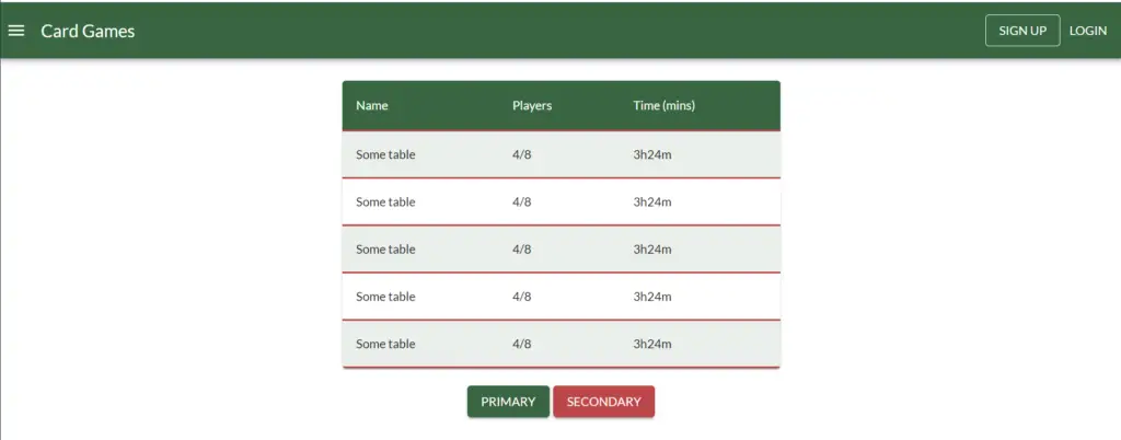
As you can see, it’s a pretty basic site, but it shows the main theme settings we’ve applied. The two buttons under the table use colours primary and secondary. The table demonstrates the row striping and bottom border that we’ve applied.
To contrast, let’s remove the ThemeProvider token and look at the same site.
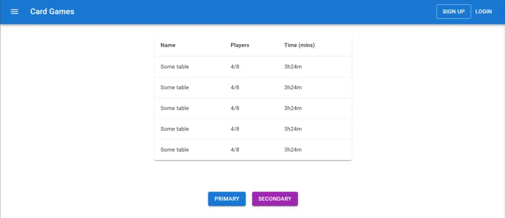
As you can see, the spacing between the buttons is larger, the table is plain, and the default colour scheme has been reverted. Even the small customisation our theme provides makes a big difference already.
Conclusion
Thank you for reading this post on theming with MUI. If you like what you’ve read or want to discuss anything, you can find me on Twitter.
To view the source code, head over to GitHub.
