In this article, we’ll build a basic UI for a card game (remember the playing card component we built earlier) using React with MUI Core. This UI will showcase the following:
- Using MUI Core components
- Implementing a navigation bar
- Faux login buttons
- Responsive Design
- A form for signing up
- Table of current games being played
- Customising MUI components to our style
The site won’t be functional just yet. We’ll fill the data with placeholder data for now.
You can view the finished product on GitHub here
What Is MUI Core?
In short, MUI core is a set of React components that can be used as the foundation blocks of your design system. Furthermore, these components have been designed with accessibility always in mind (which is super important).
MUI implement’s Googles material design.
We will follow the instructions from the MUI website to start building our application, but first, we’ll need to create the base application. For this, we can use the create-react-app script for bootstrapping a basic React app that we will then style using MUI Core.
Creating The React App Using create-react-app
npx create-react-app mui-card-game
This will create a directory with our React app ready to configure.
Installing MUI Core
Installing MUI core is done by using npm as follows:
npm install @mui/material @emotion/react @emotion/styled
The Roboto Font
Because MUI uses the Roboto font, we must import it into our application. We start by installing @fontsource/roboto:
npm install @fontsource/roboto
Once you’ve installed Roboto, we must import the fonts at our app’s entry point. Because we are using create-react-app, our entry point will be in src/index.js. You need to add the following to add all the variations of Roboto that MUI uses:
import '@fontsource/roboto/300.css';
import '@fontsource/roboto/400.css';
import '@fontsource/roboto/500.css';
import '@fontsource/roboto/700.css';
Installing MUI Icons
With material, emotion and Roboto now configured for our application, we must add Icons. This is another npm package.
npm install @mui/icons-material
Cleaning Up create-react-app
Lastly, we need to remove any styling with create-react-app in our setup. This is done by removing the two CSS files in the src folder: index.css and App.css, and references to these files.
InApp.js, remove the following line:
import './App.css';
And in index.js, remove this line:
import './index.css';
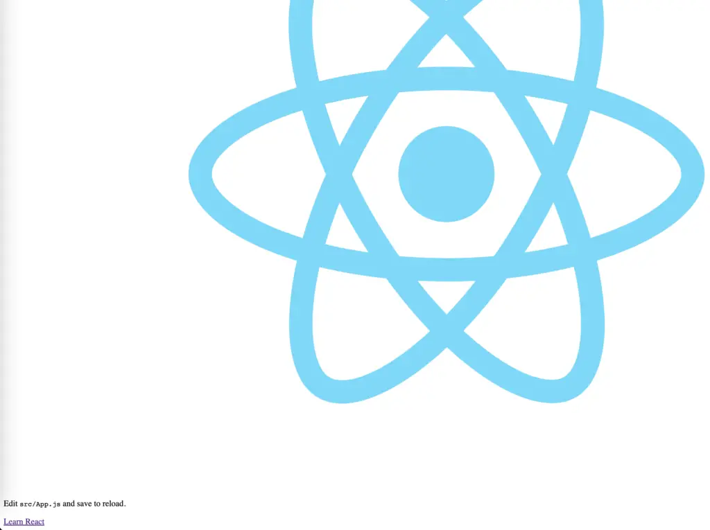
If you start the site now:
npm start
You will see the React icon with some text underneath (we’ve removed the style sheets, so the result won’t look good):
Next, we can remove the contents of App.js and replace them with our new code.
Adding A NavBar With React and MUI Core
Let’s clear out most of the contents of App.js, so we are left with this:
function App() {
  return (
    <>
    </>
  );
}

export default App;
We now have a blank canvas to build upon.
In MUI, you must add an AppBar that will act as our NavBar. The easiest way to get started is to head over to the MUI documentation for AppBar and grab the closest example to what we need. For this demo we can select the basic AppBar example.
If you copy the code, we can create a new component in our app in a new file called NavBar.js. Populate this file with the below code (The only difference from the MUI documentation is that I have renamed the function name to NavBar):
import * as React from 'react';
import AppBar from '@mui/material/AppBar';
import Box from '@mui/material/Box';
import Toolbar from '@mui/material/Toolbar';
import Typography from '@mui/material/Typography';
import Button from '@mui/material/Button';
import IconButton from '@mui/material/IconButton';
import MenuIcon from '@mui/icons-material/Menu';
export default function NavBar() {
return (
<Box sx={{ flexGrow: 1 }}>
<AppBar position="static">
<Toolbar>
<IconButton
size="large"
edge="start"
color="inherit"
aria-label="menu"
sx={{ mr: 2 }}
>
<MenuIcon />
</IconButton>
<Typography variant="h6" component="div" sx={{ flexGrow: 1 }}>
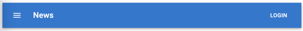
News
</Typography>
<Button color="inherit">Login</Button>
</Toolbar>
</AppBar>
</Box>
);
}
Installing Dependencies
To use the above code, you’ll need to install @mui/icons-material NPM package:
npm install @mui/icons-material
In App.js, import the NavBar component and render this component in the return statement as follows:
import NavBar from "./NavBar";

function App() {
  return <NavBar />;
}

export default App;
If we run the code, we will see the AppBar looking like this:
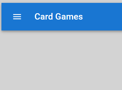
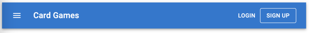
Let’s tweak the navbar to have a sign up button and to change the text News to Card Games:
import * as React from 'react';
import AppBar from '@mui/material/AppBar';
import Box from '@mui/material/Box';
import Toolbar from '@mui/material/Toolbar';
import Typography from '@mui/material/Typography';
import Button from '@mui/material/Button';
import IconButton from '@mui/material/IconButton';
import MenuIcon from '@mui/icons-material/Menu';

export default function NavBar() {
  return (
    <Box sx={{ flexGrow: 1 }}>
      <AppBar position="static">
        <Toolbar>
          <IconButton
            size="large"
            edge="start"
            color="inherit"
            aria-label="menu"
            sx={{ mr: 2 }}
          >
            <MenuIcon />
          </IconButton>
          <Typography variant="h6" component="div" sx={{ flexGrow: 1 }}>
            Card Games
          </Typography>
          <Button color="inherit">Login</Button>
		  <Button color="inherit" variant="outlined">Sign Up</Button>
        </Toolbar>
      </AppBar>
    </Box>
  );
}
We need to add a signup form to our site. Let’s do this using a modal form where users can enter their email addresses and password. The easiest way is to return to the MUI documentation and find the modal examples.
When we search for Modal in the documentation, you will see a note saying that if you want to use a modal component, you probably want to use the Dialog component. So based on this, we’ll move forward using the Dialog component.
In the documentation for Dialog, there is an example of a Form Dialog. Let’s use this as our base for the signup form. We’ll call our component SignUpForm and put it in a file named SignUpForm.js
import * as React from 'react';
import Button from '@mui/material/Button';
import TextField from '@mui/material/TextField';
import Dialog from '@mui/material/Dialog';
import DialogActions from '@mui/material/DialogActions';
import DialogContent from '@mui/material/DialogContent';
import DialogContentText from '@mui/material/DialogContentText';
import DialogTitle from '@mui/material/DialogTitle';
export default function SignUpForm() {
const [open, setOpen] = React.useState(false);
const handleClickOpen = () => {
setOpen(true);
};
const handleClose = () => {
setOpen(false);
};
return (
<div>
<Button color="inherit" variant="outlined" onClick={handleClickOpen}>
Open form dialog
</Button>
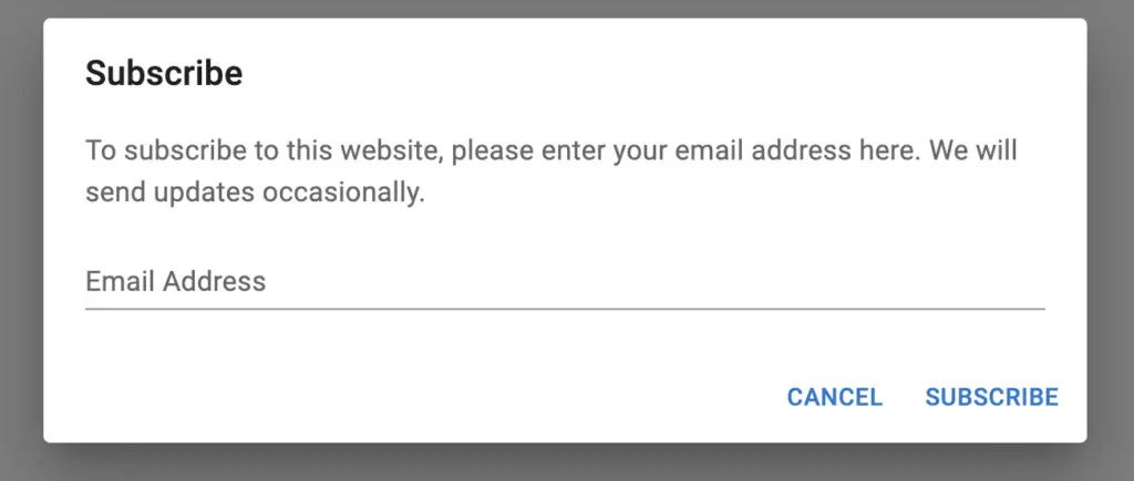
<Dialog open={open} onClose={handleClose}>
<DialogTitle>Subscribe</DialogTitle>
<DialogContent>
<DialogContentText>
To subscribe to this website, please enter your email address here. We
will send updates occasionally.
</DialogContentText>
<TextField
autoFocus
margin="dense"
id="name"
label="Email Address"
type="email"
fullWidth
variant="standard"
/>
</DialogContent>
<DialogActions>
<Button onClick={handleClose}>Cancel</Button>
<Button onClick={handleClose}>Subscribe</Button>
</DialogActions>
</Dialog>
</div>
);
}
There are two notable differences between the sample code and the code above. This ensures the button inherits the colour from its parent and the component’s name. The highlighted line shows these differences.
Adding The Dialog To The NavBar
Now we have a button component displaying a modal form for the user to enter an email address. The next thing to do is to add the component to the NavBar. We’ll replace the current Sign Up button we placed earlier.
import * as React from 'react';
import AppBar from '@mui/material/AppBar';
import Box from '@mui/material/Box';
import Toolbar from '@mui/material/Toolbar';
import Typography from '@mui/material/Typography';
import Button from '@mui/material/Button';
import IconButton from '@mui/material/IconButton';
import MenuIcon from '@mui/icons-material/Menu';
import SignUpForm from './SignUpForm';

export default function NavBar() {
  return (
    <Box sx={{ flexGrow: 1 }}>
      <AppBar position="static">
        <Toolbar>
          <IconButton
            size="large"
            edge="start"
            color="inherit"
            aria-label="menu"
            sx={{ mr: 2 }}
          >
            <MenuIcon />
          </IconButton>
          <Typography variant="h6" component="div" sx={{ flexGrow: 1 }}>
            Card Games
          </Typography>
          <SignUpForm />
          <Button color="inherit">Login</Button>
        </Toolbar>
      </AppBar>
    </Box>
  );
}
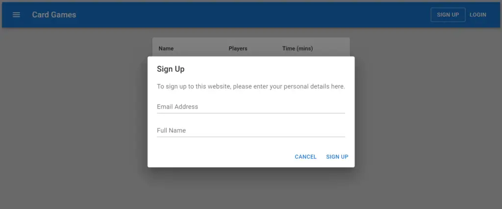
Now when we click the Sign-Up button, we’ll see the following:
We can tweak the contents of the Dialog for our needs. We want:
- Users to sign up and not subscribe
- To get users’ names when signing up.
Therefore we need more form fields in the Dialog and change some of the text.
Let’s look at the code of our SignUpForm component now that we’ve updated the text and fields.
import * as React from 'react';
import Button from '@mui/material/Button';
import TextField from '@mui/material/TextField';
import Dialog from '@mui/material/Dialog';
import DialogActions from '@mui/material/DialogActions';
import DialogContent from '@mui/material/DialogContent';
import DialogContentText from '@mui/material/DialogContentText';
import DialogTitle from '@mui/material/DialogTitle';

export default function SignUpForm() {
  const [open, setOpen] = React.useState(false);

  const handleClickOpen = () => {
    setOpen(true);
  };

  const handleClose = () => {
    setOpen(false);
  };

  return (
    <div>
      <Button color="inherit" variant="outlined" onClick={handleClickOpen}>
        Sign Up
      </Button>
      <Dialog open={open} onClose={handleClose}>
        <DialogTitle>Sign Up</DialogTitle>
        <DialogContent>
          <DialogContentText>
            To sign up to this website, please enter your personal details here.
          </DialogContentText>
          <TextField
            autoFocus
            margin="dense"
            id="email"
            label="Email Address"
            type="email"
            fullWidth
            variant="standard"
          />
		  <TextField
            autoFocus
            margin="dense"
            id="name"
            label="Full Name"
            type="text"
            fullWidth
            variant="standard"
          />
        </DialogContent>
        <DialogActions>
          <Button onClick={handleClose}>Cancel</Button>
          <Button onClick={handleClose}>Sign Up</Button>
        </DialogActions>
      </Dialog>
    </div>
  );
}
As you can see, there is now another text field for users to enter their full names into. We’ve also altered the description a little to suit our needs. The output of the above code looks like this:
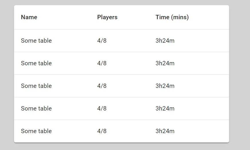
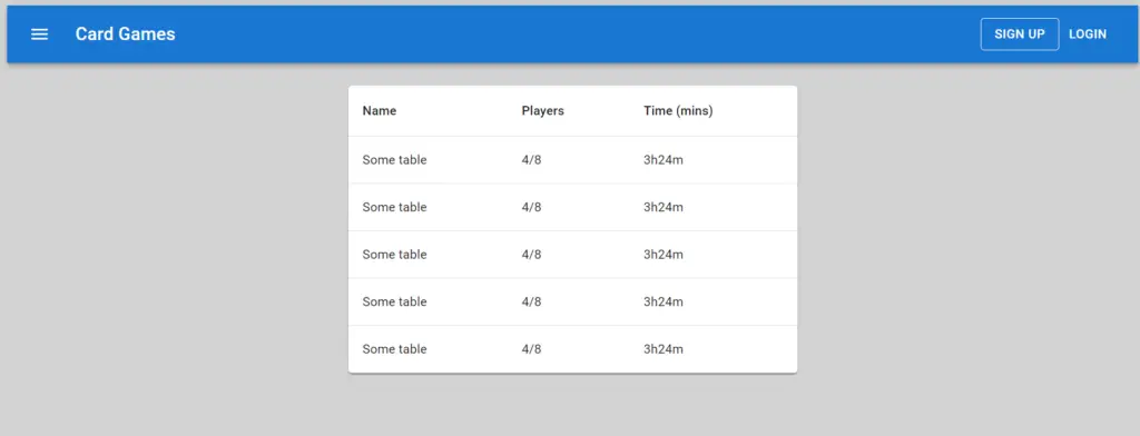
Creating The Current Games Table
Now that we have completed the faux login button and signup form, we will add a table showing a list of all the current games currently being played online. We will use dummy data to populate the table to show how easy it is to get a decent-looking table going with MUI.
The table structure is simple in MUI. Here is the code that will build a table:
<TableContainer sx={{ maxWidth: "500px" }} component={Paper}>
  <Table>
    <TableHead>
      <TableRow>
        <TableCell>Name</TableCell>
        <TableCell>Players</TableCell>
        <TableCell>Time (mins)</TableCell>
      </TableRow>
    </TableHead>
    <TableBody>
      {data.map((row) => (
        <TableRow key={row.id}>
          <TableCell>{row.name}</TableCell>
          <TableCell>{row.players}</TableCell>
          <TableCell>{row.time}</TableCell>
        </TableRow>
      ))}
    </TableBody>
  </Table>
</TableContainer>
In the above code, I’ve used the component type to be paper for styling purposes. The rest of the code resembles an HTML table quite closely.
In the table body section, I used an array and mapped out each row based on each element in the array. The resulting table looks like this:
Putting It All Together
Now that we have our header and table, we can look at the entire page as a whole:
The following image shows the site after the signup button is clicked:
Conclusion
With just a little bit of customisation, we’ve generated a basic page structure with MUI that looks professional and is accessibility friendly. This goes to show how powerful using a UI framework can be. It also shows how well React and MUI Core work together. Thanks for reading!
