The Box component in MUI differs from a div in that it is a React component that can take the sx prop to access the MUI system properties. This article will compare the MUI Box vs HTML div.
Let’s start with the MUI documentation description of the Box component:
The Box component serves as a wrapper component for most of the CSS utility needs.
https://mui.com/material-ui/react-box/
We can easily understand that a wrapper component drives styling or overarching information down to child components. The difficulty in this description is understanding the “CSS utility needs“.
But first, let’s look at what the Box component outputs in HTML.
What HTML Does Box Output?
To understand the CSS utility needs, it’s important to understand what Box components output when rendering. Let’s start with a simple example:
<Box>Some text</Box
Outputs:
<div class="MuiBox-root css-0">Some text</div>
The Box component outputs a div but sets the class to MuiBox-root. This means that all styling will come from MUI for the elements contained within our Box. This is the first part of CSS utility needs
MUI System Style Functions
If you read further, the documentation mentions that:
The Box component packages all the style functions that are exposed in @mui/system.
An example of a style function is bgColor. This is a shorthand version of the background-color CSS property. The following code is a good example of using bgColor. Notice that we use this style function within the sx prop.
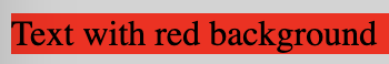
<Box sx={{ bgcolor: "red" }}>Text with red background</Box>
Using Theme Mapping With The MUI Box Component
The biggest benefit of using the Box component, at least in my opinion, is the access to the theme mapping. This allows the developer to access theme options like palette or spacing. Here is a quick example showing how to use these theme options with the box component.
<Box sx={{ bgcolor: 'info.light', p: 5 }}>Text with blue background</Box>
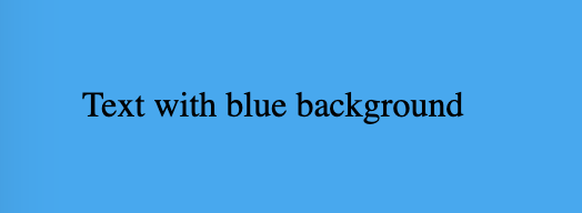
The above code uses the palette setting of info.light, the blue we see above. The p: 5 sets the padding element to 5, as shown in the space around the text in the image above.
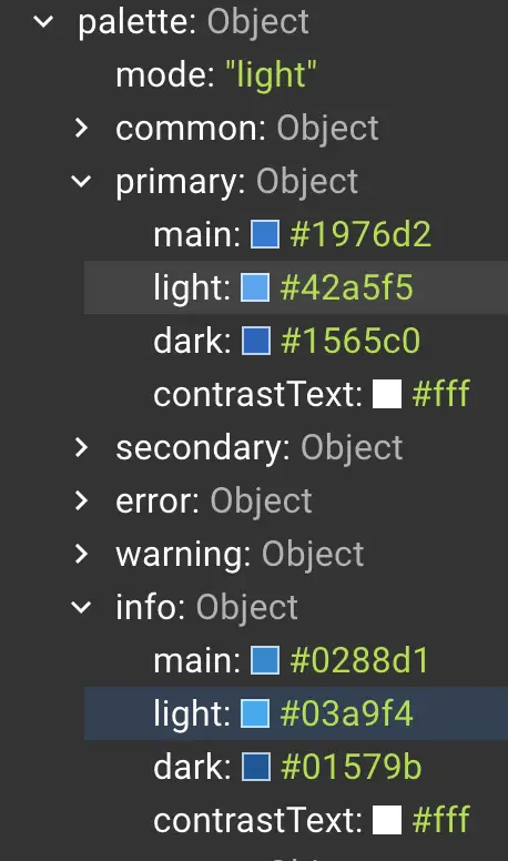
The image below shows the theme properties tree where we select the info.light property.
It’s worthwhile looking at the default theme options in the documentation. It can be found here.
The alternative way to get a standard div to access the system properties would be to import them into your file and use the variables to drive the styling. The above method circumvents the need for all that and can focus on your design.
Conclusion
There is not much more to the Box component than this. It allows you to wrap your elements so that they inherit the MUI theme, as well as allowing you to select directly from the system properties. Hopefully, this helps you understand the MUI Box vs HTML div.
Thanks for reading!
